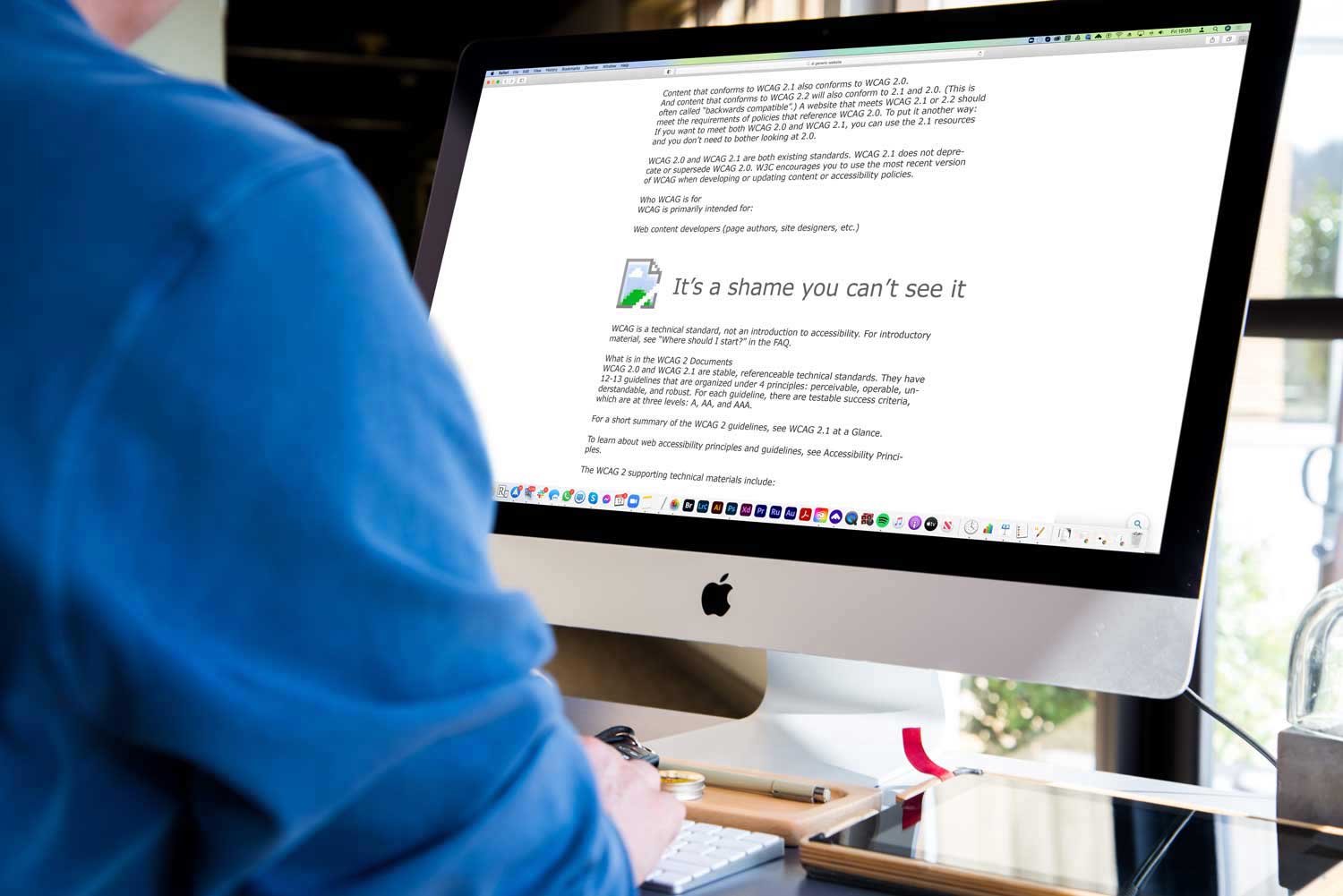
First off, let’s define what we are talking about. Web accessibility means that people with disabilities can use the Web equally. According to the World Health Organisation about 15% of the world’s population, (over 1 billion people), are estimated to live with some form of disability. In addition. the UN Convention on the Rights of Persons with Disabilities (Article 9), defines access to information as a human right, and the web is now where most people get most of their information.
Disabilities that can affect web users’ access can come in a number of forms, an impairment that is either physical, sensory, or cognitive, all of which can make a difference to their experience of your site. Listed below are 4 things every web designer should have an awareness of, but they are by no means an exhaustive list.
Your site should be Keyboard-Friendly
Not everyone can use a mouse or a trackpad easily, or even at all. Many users with age-related impairments, for example, may not have the fine motor skills to control a point and click device effectively. While others may not have use of their hands at all and rely on solutions like using a mouth stick to type. The trouble is, point-and-click is so taken for granted by the rest of us as the most simple and intuitive way to interact with a screen that alternatives may not even be considered when designing a webpage.
The most common way of navigating using a keyboard is by using the Tab key to cycle through elements on a page that can have “keyboard focus” . These can be links, buttons, and form fields.
Ensuring that all web content and navigation can be accessed using Tab, makes a difference to someone with a physical impairment. The difference being between using your page easily and becoming frustrated by it.
All Images deserve Alt Text
When designing a website, it is natural now to use a lot of visual media. A picture, supposedly, is worth a thousand words and can serve to illustrate an idea far more effectively than a paragraph of text. Except, of course, if you can’t see the picture.

Colour blindness isn’t black and white
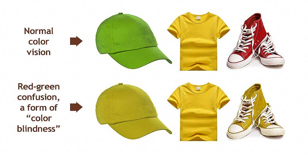
Okay, it was a very cheap pun. But it’s also very true. Colour blindness isn’t the inability to see colour, more of a deficiency in the way it is perceived. Colour blindness (or, to be super-accurate, Colour Vision Deficiency), affects an estimated 8% of all males and 1% of females, which translates to roughly 3.3m people in the UK alone. The most common form is red-green colour deficiency. Even people who do not register as colour blind may perceive colours differently from each other (remember “the dress”? Or even the “Blue or Green” optical experiment?

Consider your content
The content on your site is hugely important. Arguably, it *is* your site. Giving appropriate consideration to accessibility issues when designing the site goes a long way, but the content that goes into that site is just as deserving of that consideration. Accessibility of content covers a spectrum of issues from little things like making sure any acronyms used have been explained, to more consequential points like making sure all your links have unique and descriptive anchor text, or that your written content is structured well on the page. For the latter, good use of heading tags pays dividends for anyone using a browser for visually impaired users. These examples are just the tip of the iceberg, of course. The World Wide Web Consortium (W3C) developed the Web Content Accessibility Guidelines (WCAG) to help anyone developing content for the web make content more accessible, primarily for people with disabilities—but also for all users (both human and software). They are an invaluable resource and well worth studying if you work with the web.
From the very few examples given above, it should already be apparent that accessibility should be a crucial consideration in your website design if you are to provide access to all users.
But more than that, keeping accessibility in mind encourages good practice generally creating content for the website.
For example, insuring higher contrast for text can help people with visual impairment, but also anybody who is trying to read something on their phone with adverse environmental conditions (like glare). Structuring a text document well so that it can be better navigated by a speech browser also has the advantage of making it easier to read for everyone.
And let’s not forget to very self-serving considerations for building accessibility into your website.
Firstly, SEO. Google likes accessible websites. The more that your site does to comply with W3C guidelines, the more likely it is to rank higher than a similar site that does less.
And of course, the more you do to make visitors with accessibility needs feel welcome, the more likely they are to use, return to, and even share your content. Which is a win for you.
Posted by: Jean Paldan
Feb 12, 2021


