Should you Refresh or Rebrand? Examples of Successful Revamps
If you’re a business owner in the Oxford area and are considering a design overhaul for your website, it can be confusing to know whether to go for a rebrand or a brand refresh. Web design is an important part of any business, and getting it right is essential to achieving success. In this blog post, we’ll be exploring the difference between rebranding and a brand refresh and helping you decide which is the best option for your business.
What’s the big deal?
A coherent, compelling brand can be the difference between your company being taken seriously or ignored. Most companies, once successful, will evolve over time and tweak their branding for various reasons including adapting to an ever-changing market. Of course, what you offer has to be solid and you have to be good at what you do. But without that fascinating first impression, you can easily be a left-swipe. As any chef will tell you, the first bite is with the eye. Once your potential customer is visually pleased, they can go on to devour all the content, but it’s that first look that fixes expectations.
So ask yourself – what mood and tone are you hoping to convey? What impression do you want visitors to get of your business at their very first glance? It’s probably even more important than your “elevator pitch” as it influences an unconscious decision made by the viewer, potentially building trust instantly, and ultimately deciding whether someone engages or not.
If you think your logo and branding aren’t up to the job, there is something you can do about it. One of two things, actually. Either you can refresh your identity, or completely rebrand. To most, there’s not much difference between the two, but to us design folk they are two very different ways of approaching the problem.Let us take you through it with examples of how we’ve done it.
Brand refresh
Perhaps you have branding in place but feel it only needs a bit of a spruce-up? Or maybe it is simply too recognisable or too entrenched in your company’s day-to-day operations to completely start again. Maybe your logo was made 10-20 years ago in Microsoft Paint (and it shows), but you like what it’s communicating and would like to keep the idea (but make it look much more professional).
If any or all of these apply then a refresh is what will suit you. A brand refresh is a process of refining and updating an existing brand identity to make it more relevant and engaging for customers. Unlike rebranding, a brand refresh does not involve creating a completely new identity for a business. Instead, a brand refresh is about making subtle tweaks to an existing identity to keep it fresh and up-to-date.
The process of brand refreshing usually involves examining the existing logo, colour palette, typography, and design elements of the brand. These elements are then tweaked or redesigned to give them a more modern look while still keeping the core identity intact.
Here are some examples of brand refreshes we have carefully implemented for a couple of our innovative clients.
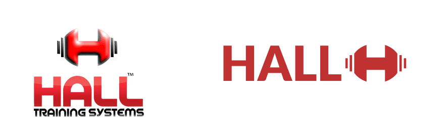
Hall Personal Training
Hall Personal Training liked the barbell “H” in their logo but felt the overall look could do with some work. We gave them a refresh which included simplifying the H from what looked like a 3D element (with shadows and highlights) to a solid element which was just as recognisable but able to be used in many more situations. We also chose a typeface with a more clean and polished look, with balanced proportions and consistent spacing which was more likely to be perceived as professional and credible.
Care With Heart
Care with Heart is a niche care agency specialising in helping adults with learning difficulties live their best lives. Though their owl graphic was highly recognisable, they wanted their branding to reflect that they were committed to helping their clients improve their lives rather than simply providing daycare services.
We cleaned up the owl graphic a little and tweaked the colours used for it. We also completely changed the typeface to one more in keeping with the earnestness of their intent. They now present as an agency that genuinely helps its clients rather than just somewhere for them to be for periods of time.
Rebranding
Rebranding is a comprehensive process that involves changing the look, feel, and messaging of a brand. It typically includes changes to a brand’s logo, visuals, website, social media presence, and any other elements associated with the brand.
The process of rebranding requires commitment from stakeholders across the organization, as it can have an impact on both customers and employees. Rebranding is often seen as a necessary step for companies that have evolved significantly over time, as well as companies that are attempting to reach a new audience.
It is quite different from a brand refresh, which is a less comprehensive process that involves making smaller changes as outlined above. Being a much more involved process, it typically requires a deeper understanding of the target audience, the competitive landscape, and the desired positioning of the brand. A rebrand should be considered if your business has undergone significant changes and the existing branding no longer accurately reflects the company.
Here are some examples of rebranding that Rare Form has helped clients with:
Clapperton Media Associates
Guy Clapperton started providing media training two decades ago. Since then his business has evolved from himself, to himself and associates, to what is now a bona fide agency. Our job was to change the branding to reflect the change in focus from Guy himself to the collective of talent that now makes up the agency.
To start with, we recommended changing the forward-facing name of the agency from Clapperton Media Associates to Clapperton Media Training, reducing ambiguity about what they do. We replaced the previous logo, which was just a bit too busy, with a much simpler version based on the C of Guy’s signature and a clean, professional-looking typeface that would resonate with his audience of PR agencies and tech corporations. What we delivered was branding that still placed Guy at the head of the agency, but no longer the centre of it.
Talboys Utilities (TUSO)
Talboys Utilities Services (Oxford) have been working with the water network for almost half a century. In that time they have evolved from laying pipes and fixing leaks to providing fully managed service for utility companies such as Thames Water. They wanted their branding completely revamped to reflect the change and give a more corporate air than the previous identity.
We jettisoned the cooper-style typeface with all its less-than-professional inferences (think ‘Vote for Pedro’ tee shirts) and replaced it with robust sans-serif lettering and integrated the wave motif directly into the letters rather than being a background. Their result was a simple two-colour branding that looks sharper, can be used more easily in various applications, and directly illustrates the sector they work within.
So which is best for you?
First of all, you should ask if you even need either. But the chances are that you found this article because you’re thinking of one or the other in terms of your site’s web design, so it’s more likey a question of which not if.
Hopefully, with the explanations and examples above, you’ve been given a good idea of the difference and how each is applied. If you are still unsure which suits you best, get in touch with us and we’ll be genuinely happy to advise.
the relationship has ended up more like a partnership
Clapperton Media
Rareform designed my website at clapperton.co.uk and they have been responsive, really good at hand-holding, and listened not just to the brief but insisted on getting an idea of what my objective was rather than just making something that looked pretty. If you need a website designed but also need it to deliver for you, I'd recommend them; the relationship has ended up more like a partnership than a supplier/customer thing.