1. Impress a Penguin
This simple and sweet illustrative website, that is actually for a job opening at Penguin Press. Its a simple, infinite scrolling site with animated graphics. A great example of how a website design can reflect a company’s ethos and culture. They took a risk with this – it’s not what you automatically expect from a job ad but just goes to show that taking a risk can pay off.
2. SOW (Saving Orphans Worldwide)
A great looking site for an orphan’s charity. It helps deliver it’s important message with great typography, as well as a colourful and stimulating design. A site like this must be so effective in garnering support for such a worthy cause. Great to see charities like this embracing cutting edge web design and shows how vital the website is to a charity or business nowadays.
3. Bond Cars
Another scrolling site that uses clever transitions to display the next image. You can view all the Bond cars from the last 50 years. This site gives you a comprehensive roundup of the beautiful cars used in the Bond films but in a fun and interactive way. This site is definitely shaken not stirred 🙂
4. The Mealings
A lovely couple and an innovative scrolling site. A really unique design for the site that really shows the personality of the married designer (her) and coder (him). A great use of whitespace, shiny graphics and subtle animations. And it’s always nice to see a husband & wife team so talented and in love 🙂
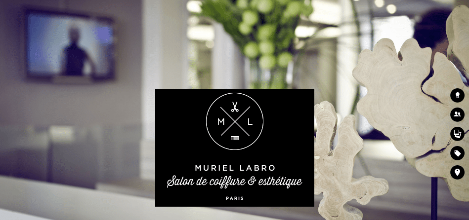
5. Muriel Labro
This site uses big, beautiful photography and great custom graphics. They only have a small amount of information showing how streamlined content is so effective in this day and age. The majority of people today may not want to spend time scrolling through reams of text, so clear and straight-to-the-point content plus beautiful aesthetics is definitely a winning combo. The site utilizes it’s design to get it’s message across clearly and shows off the personality of each individual working there and the company as a whole. Would definitely love to go for a beauty treatment here!
6. Hunter and Heath
My favourite Rare Form site is hard to choose from as there are so many but today I’m liking the new site we recently did for Hunter and Heath. Our Lead Designer Jeannie also created the name, logo and branding from scratch. The site is so appealing & consistent and I love the tree in the logo which appears in different places across the site. That’s the beauty of a pull-apart logo! In the brief, it was stated that the site should appeal to both sexes and think we achieved that effectively with the brown & blue colour palettes, the graphic details such as sketchy lines and borders, the clean and clear layout & use of larger fonts and images and spacing which seems to be trendy at the moment. Also love the tall, skinny, contemporary font used for headers. The lovely textures reflect skin and beauty and just add to the overall personality. The team at Hunter & Heath are absolutely lovely, a real joy to work with and we’d highly recommend their products. In fact, a Hunter & Heath product would make an excellent Christmas present 😉 (you can pay me later Hunter & Heath….)
Posted by: Joss Earl
Dec 20, 2012


