


Since 1998, we have had a lot of people straight out of college work for us either as interns, or full placement. Here is the list of practical things (that I was surprised they were not taught at university) that will help you design better for the web.
1. Personality is key…make sure you design for it.
With template websites being more widely used, and people using services like Wix (I threw up a little there), when people come to professionals to buy a website, they are here so that they can have something unique and better than a bog-standard template. To do that you need to inject personality. Whether it is through clever use of animation, great font pairings, or just great imagery and copy, get the personality of the business across in all things.
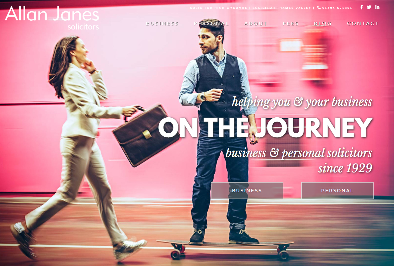
Web Design Example: Allan Janes, a firm of solicitors in High Wycombe, wanted their new website to be something bold and approachable, but still showed that they are established. We found a great image of a guy on a skateboard with a woman handing him a briefcase and paired that with the phrase ‘helping you and your business on the journey’. Using a classic italic font paired with a bold font in all caps helped bring this to life. (Pro tip: Too much going on (like overuse of animation) is not ‘bold’, it puts someone off and they don’t know where to go and what to click. Be clear with your intentions, and what you want your visitors to do). Designing a website with the personality of the web design client in mind is key to making a unique website that will speak to their clients.
2. Design in XD or Figma, not Illustrator or Photoshop.
In the days of old we designed in Flash and Dreamweaver (yes we’ve been making websites for that long). Since then web design has gone through an evolution. Photoshop became the next established web design tool, followed by Illustrator, and now web design professionals are using XD and Figma. We use Adobe XD as we find that it’s features are more powerful, and it integrates seamlessly with the Adobe platform, and our internal file management in the cloud is a lot easier to manage.

3. Design websites for desktop first (maybe).
I know, I know, the design community is all about mobile-first. But there are two scenarios when you make a website. Starting from scratch with a brand new venture, or starting with an already established website that has data, and these will determine what you should do.
- Designing a website from scratch (no analytics data). In this case, I still suggest that you design for desktop first. Over the years, I have found that clients approve a homepage based on its desktop design 90%+ faster than if they are shown a mobile version first. If you just have one design to show them, you can get the style honed to a fine point and approved much faster.
- Designing a website off of an existing website and their data shows that they get more mobile than desktop. Design the website for mobile first. In this situation, once the mobile mock is approved for the homepage, I suggest then designing the desktop version, getting that approved then moving onto the inner pages.
4. Designing a website homepage in full viewport (so it scales well for mobile design).
If you are designing a website and want it will scale beautifully for every sized screen, then designing this to full viewport is a great help. Generally we only do this for homepages, as it makes for a nice aesthetic, but this can work very well for inner pages as well depending on the content. Because homepages are more of a TLDR for the entire website it’s easier to achieve as paragraphs and content is usually shorter. At the very least the hero image and section should be full viewport on your homepage, this is of course a design decision, this just tends to make things easier when designing for all screens, and when it goes to development.
Fun trick that makes this simple. When you start a document in XD, start with a 1920 x 1080 artboard. Create a simple rectangle in an obvious colour that is exactly 1080px in height. Keep that on the side. When you have a new section, just use the rectangle, make the artboard longer, and either move the rectangle or copy it and put it underneath the one above. Keep the content in each 1080 section. You can have elements hang over for aesthetic purposes, but keep the main content in the section. You can use this for any screen size, and works very well for mobile.

5. Never use the Logo font anywhere else on the website. Ever. Never ever.
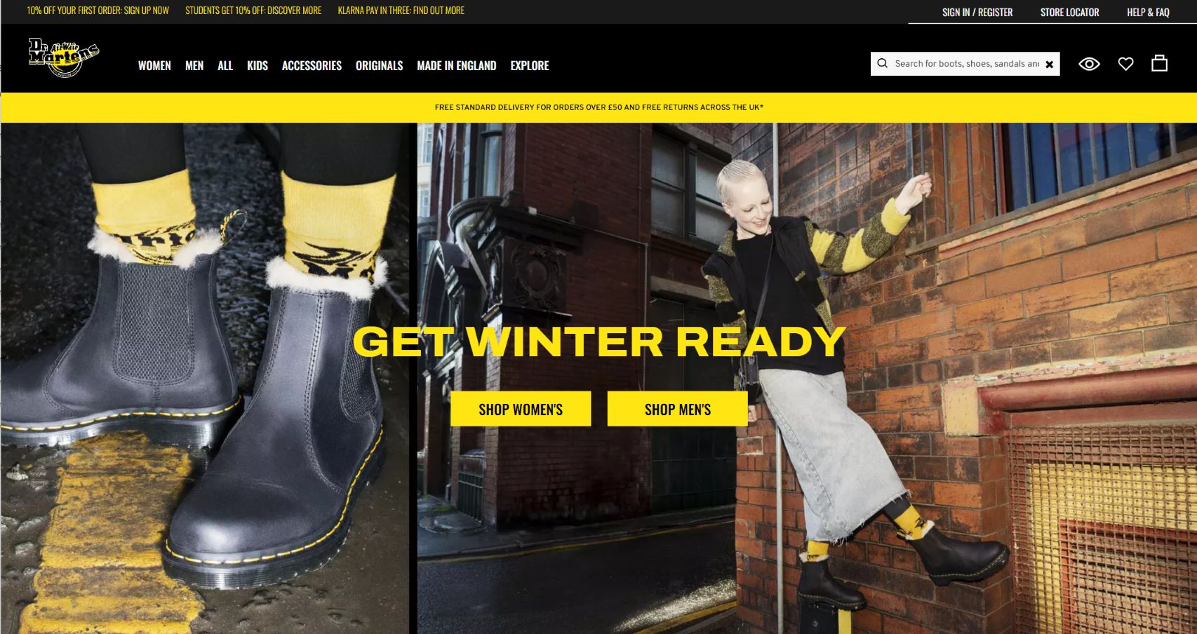
I cannot believe that a few of my interns were not taught this, but using the same font for the website weakens the brand. Imagine if iconic brands like Coca Cola or Adidas used their font on their website…shiver. Brands should have a strong logo with supporting fonts that work with the brand’s image. Here Doc Martens is using strong sans serif in Doc Marten’s yellow. This works to create the desired tone, without distorting the image of the brand as a whole. But what if I am not an iconic brand you ask? If you ever hope to be, don’t use the same font as your logo anywhere else (that means in print too).
*Pro tip: If you’re a font nerd like me, install the chrome extension called Font Ninja, it will tell you what the fonts are on any website. Doc Martens uses Archivo (extra bold, semi expanded) paired with Oswold.
6. Design with SEO (& marketing) in mind.
When you are designing a website, you are making the most essential piece of marketing in your client’s toolkit. To ensure that it will actually be found on the internet, you need to know how to design and get SEO integrated into the design (a full article on this will be coming soon). This is speaking to design, so assuming that all of the SEO research has been done before, you’re then ready to move onto the design. To design with SEO, here are some basic tips:
-
Make sure that you have enough keyword opportunities. Your SEOers should be able to tell you how many of these opportunities you will need to rank the page. This means how many titles, and paragraphs you will need to make sure that you have enough content.
- Design it so it looks and reads naturally. You still want to have your marketing message, but you also want to get in the essential keywords. We want Lumina to rank for ‘decision making software‘, so we made a smaller title at the top to achieve this.
-
Get creative. If the keyword string is long, or just isn’t looking right, try moving it to the side, rotate it, get creative. Just make it look like it is part of the design.
-
To get the keywords into the rest of the page, obviously this can be done in the titles and paragraphs, but it may not be enough. You may want to add list of service links, FAQ’s, strategic testimonials, so that your SEOed content has places to live.

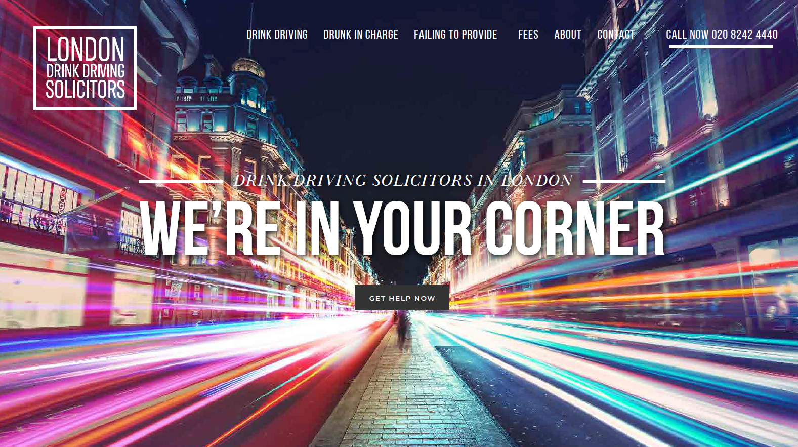
Another example, we are currently making a website for a solicitor. They want to rank for London Drink Driving solicitors. You can see in the image below where we worked it into the website. We did this website awhile ago, and they have consistently ranked number 1 for that keyphrase.
7. Use as limited a colour palette as possible.
It is very easy to create a website with every colour imaginable, as it’s fun. But colour increases brand recognition by 80% (study done by Stanford). And customers that remember you are customers that come back or refer you to others. All of the major brands do this, so the local store that wants to expand…do them a favour and encourage them to pick one colour as their ‘brand colour’. From there you can have subtle tonal accent colours, like neutral greys, black/white, or beiges, but nothing that takes away from their core colour.
Now that you have their colour, make sure you use it strategically around the website. Don’t make the entire website white with blue accents…mix it up. Make a section blue, another grey, another white, and so on. Just because it’s just one colour doesn’t mean that you can’t have fun with it.
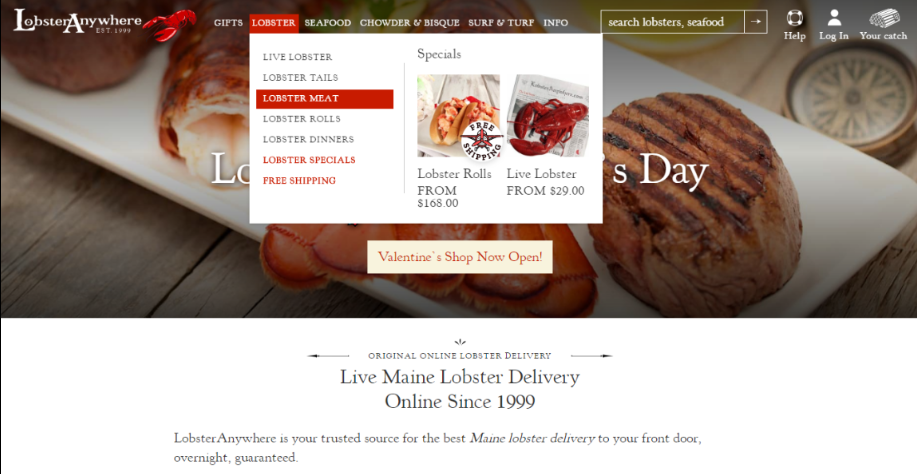
Web Design Example: We created the new design for Lobster Anywhere, the largest (and most awesome) online Lobster retailer in the US. When we started the design we wanted to make sure we worked the iconic red of the lobster into the design. We used it in mouseovers in the navigation, and in buttons throughout the website. It’s a small, but strategic use of the brand colour that helps customers with brand retention.
8. Done with the design? Share the XD link and mark it up with directions.
Whee, you’re done with your design! Note that this list varies with each client, but here is my five-point reference list of things that I note for developers to make their life easier to ensure I get the website I designed:
-
Colours. Give them all the Hex colours upfront as it will save them time. Be specific, ie. hex colours for mouseover states if they are different (say if you’re going from brand red to a darker red, give them that hex).
-
Menus. Let the client and your programmer know how the menus will look and work, made them specific XD artboards for desktop and mobile. If there is specific or special movement, let them know how you want it to work, be specific.
-
Animations. If anything is to be animated, note it. This will include things like special cursors and mouseover effects. Give them directions on how all animations should work, and if you can give an example of it live on the web if you can. Anything you can give your developers to make their lives easier do it.
-
SEO. Remember that SEO you put in earlier? Any SEO text that you put in there highlight and make note of it. If you know which ones you would like to be H tags let them know.
-
Site building (fade-ins, slide-ins etc.) When you mouse down, will the site ‘build itself’? Is the header text fading in first, and then the paragraph? Is it sliding in the in boxes you designed? The key here is to be specific. I usually like to pick one type of build technique and stick to it. Too many fancy slide-ins and fade-ins make a site too busy and can increase load time if not implemented properly. Speed matters with SEO, so only use what you need to for impact for your users.
This is a series we dip into from time to time on tips for designers. You can read another we did about designing for print and how to make a great CV for designers. Have a happy fun day, and design your hearts out.
Posted by: Jean Paldan
Nov 01, 2023