Here at Rare Form, we are acutely aware of the importance of good web design. Not simply because we want an impressive portfolio of sites that show how gosh-darn clever and creative we are (that’s just a happy by-product), but because it is essential to our clients. According to a Stanford University study, “75% of users admit to making judgements about a company’s credibility based on their website’s design”, and a well-designed site can be the difference between whether a visitor stays on your site at all or not – according to Adobe, over a third of all users “will stop engaging with a website if the content is unattractive” (and this decision is usually taken in just 0.05 seconds).
And what is considered ‘good design’ is always evolving. Between the constant emergence of new web technologies, changes in how people access sites, and the ongoing evolution of digital culture, new trends in web design are always happening. Here are the top five design trends of this year that we believe will pave the way for what the web looks like in 2021:
1. Come to the Dark Side
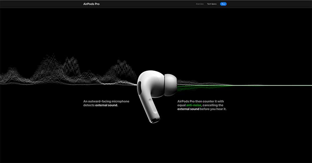
No, we not talking about the emergence of the WebSith – Dark mode is an ultra-modern look and feel with very practical roots in UX design. Dark mode, (or dark theme), reverses the standard dark-on-light user interface to give two specific benefits – firstly the device in use does not have to emit as much light, and so electricity consumption is reduced and battery life extended. Secondly, as dark mode reduces the amount of light entering the eye it reduces eye strain and arguably makes it easier for you to get to sleep.
But on top of the very practical benefits, there are also aesthetic advantages. Colours tend to have more impact against dark backgrounds and website elements are easier to highlight to the viewer.

2. The Future is… well, different colours.
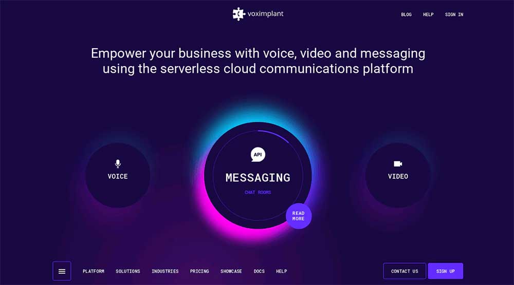
As we move into the 20s, web design is becoming more colourful, with braver and bolder combinations. Glowing, luminous colour schemes are especially on trend, not only because they convey a futuristic feel, but also because they pair exceptionally well with Dark Mode design.

3. Asymmetrical design
Asymmetrical page layouts expand the limits of traditional web design in apparent defiance of one of the most foundational elements of user interface design—the grid system. Whereas once, page layouts tended toward perfect symmetry and order, designers are now experimenting with more dynamic, unbalanced structures to give sites a more unique and playful feel. Ironically though, the best asymmetric designs are still based on balance. Users may be becoming bored with sites that appear to ordered and lined up, but the brain and eye don’t absorb information well amongst chaos. The trick is to give the appearance of disorder, whilst ensuring no part of the page carries significantly more weight than others.
4. Soft shadow & floating elements
Images that appear to float above the page combined with soft shadows infuse positive emotional responses – they make the design layered and more interesting by implying depth, making the web page look slightly 3D and hence more ‘real’. The trend is applicable not only to individual graphics but also to photographs, videos, text headings, and even the body text itself.
5. Immersive and interactive 3D
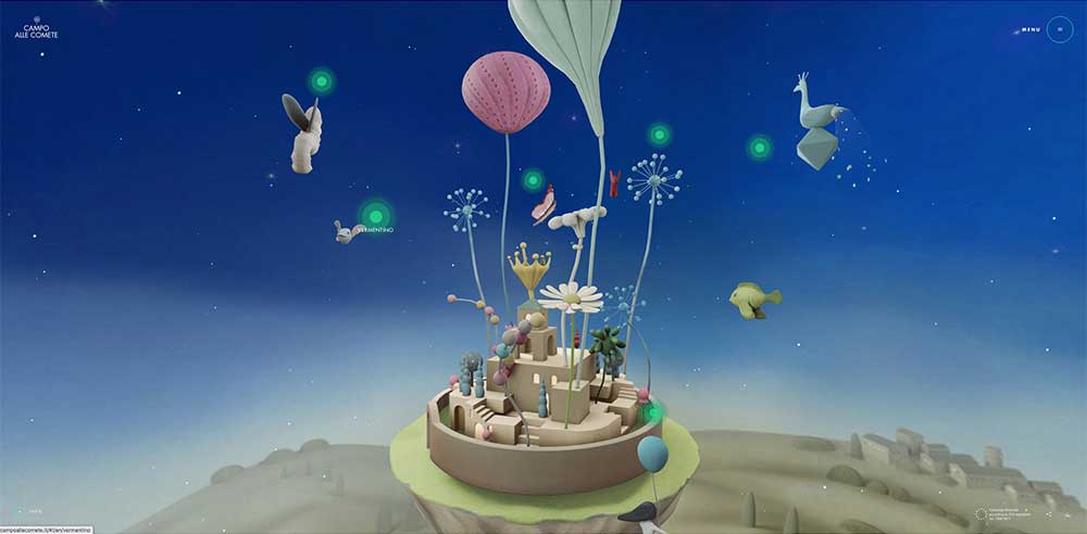
3D design elements have always been a sure-fire way to add wow factor to a design, provided they are used well and not simply for their own sake. With VR and AR technologies gaining momentum and becoming more accessible, this trend is only going to advance further as designers have more resources at their disposal to implement 3D elements, often at the very heart of page designs. Take shutdown.gallery, a 3D immersive online gallery where you can walk around a virtual space to view the various electronic artworks on show, all in the browser window, or the Campo Alle Comete website which uses an interactive 3D artwork for navigation to beautiful and breathtaking effect.

Looking to the future
Now the 10s are behind us and we head into the 20s, web design has never been more exciting. With our boxes of tricks being ever expanded by advances in UX design and advancing web and 3D technologies, designers are using all the tools at their disposal to make websites even more attention-grabbing and pleasing to look at, so that clients get more engagement from their sites and users actually enjoy visiting them.
Posted by: Jean Paldan
Aug 05, 2020


