Here are my 6 (I know it said 5, but I thought of another one!) favourite websites of 2012. These showcase the current crop of features and functionality. Also looking at where sites are heading. Also, I like them!
1. HTML5 Jam with Chrome
Coming from Google’s creative lab in collaboration with Swedish developers Dinahmoe; Jam with chrome utilizes Web Audio API. You can set up jam sessions with friends across the web and become online rockstars! The exciting prospect of Web audio API is that it’s another step towards your browser becoming the operating system. Reducing the need for native applications on an operating system and increasing the potential of a web browser.
2. HexGL HTML5 Game
This in-browser game is a tribute to the console game Wipeout. 17 years after the game’s release, French university student Thibaut Despoulain created an HTML5 version as a student project. This is once again, an excellent example of the potential of web browsers.
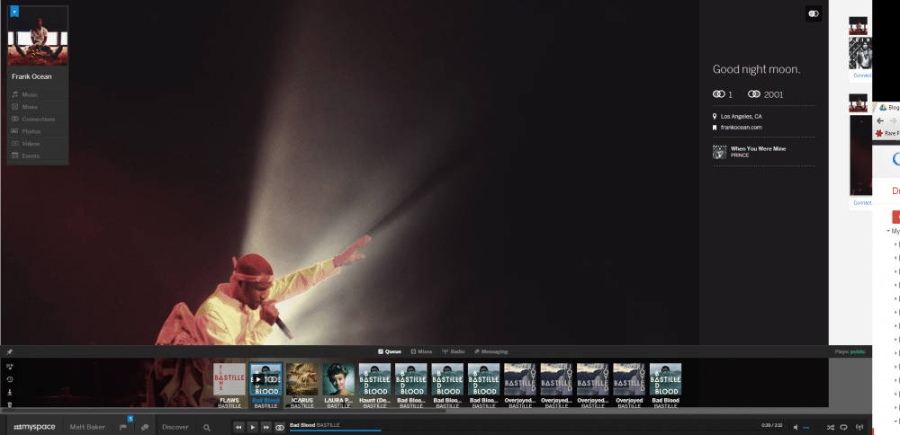
3. The New Myspace
In recent years social media sites such as Twitter and Facebook have been part of our daily lives. It seems like a distant memory when myspace was relevant, but now they are back. Integrating social networking with music streaming services. They have also come back with a polished site that has a big touch screen influence. On a tablet, the lateral scrolling is smooth and fluid. Being able to search for something from anywhere on the site just by typing is also fun to play with. Whilst people may question the site’s place, it’s a joy to look at, as well as a hint as to where functionality is going.
You currently have to receive an invite from Myspace (I have one!) but register here
4. UBC Coren
2012 has seen a rise in infinite scrolling websites, this is where a site displays all it’s content on one page. It’s an effective way to get your information out and can be used with cool animations. As you scroll down Coren’s site different information boxes and images slide in from the sides. These scrolling sites are another indication that touch screen mobile devices are factors in web functionality.
Shiny Bikes!
5. Starbucks
Another rising need for websites is responsive design, once again a need driven by the increase in varying device types and sizes. Starbucks look to have spent most of their tax savings on a shiny site that is responsive. You can stretch or squash the site it in your browser and it will react accordingly. An excellent example of how a site should work in any device.
6. Reeds Solictors
My favourite Rare Form Site is that of Reeds Solicitors. It looks great and delivers the Oxford feel that they desired; but it really stands out in the way you interact with it. Going through the main navigation bar, rotates the site sideways like a rubix cube. Using the sub menus on page rotates the site vertically.
Rare Form Web Design
Check back later for Georgie’s favourite designs of the year!
Posted by: Joss Earl
Dec 19, 2012


