Rare Form has been in business since the last century. In that time we’ve made many different sites, of different types, for many different kinds of clients. We know a lot about what makes a website work well, and we also see what can send site visitors running screaming into the night.
(Well, maybe not quite that dramatic, but as far as you as a site owner should be concerned, visitors simply leaving your site without doing anything is just as bad).
Below are two small lists of things that improve any site, and things to avoid, regardless of whether it is a simple brochure website or a full e-commerce site.
Must Haves
1. An immediate statement of what you do.
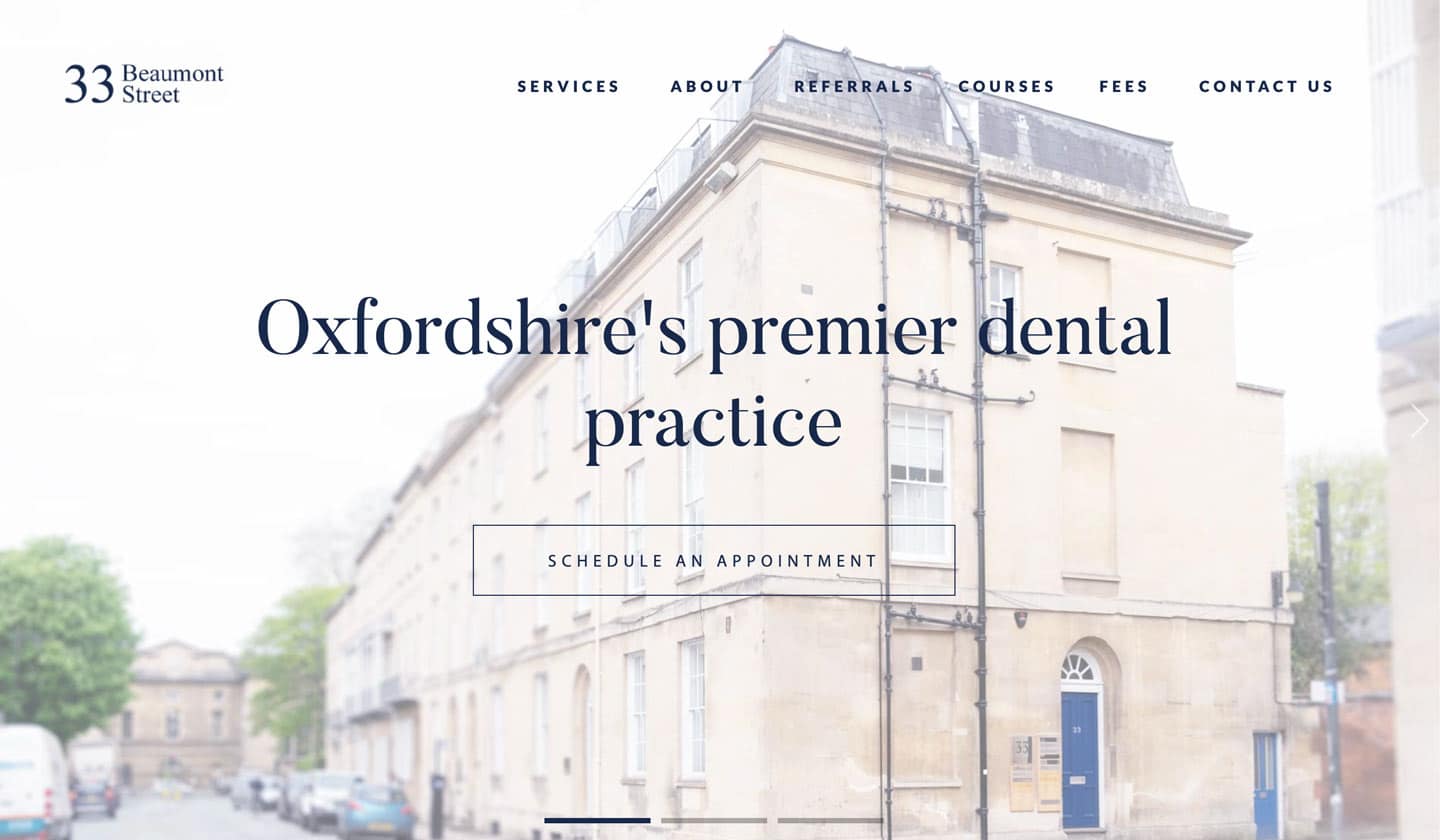
First impressions are everything. Don’t assume that every visitor to your site already understands who you are and what you do. Many will have arrived from one of a number of results for a given search. When your home page loads, you want the first thing they think to be “I’m at the right place”.

Be direct. Don’t try to be clever, or a maverick. If your site’s audience’s first impression is confusion or uncertainty, the one sureness is that many will leave to check the next search result.
2. Clear and Meaningful CTAs
Having people come to your site is good. Getting them to engage somehow is great. Bear in mind that almost everyone that comes to your site does so for a reason. And that reason is usually that they want something. If you can give them an easy and obvious route to what they’re looking for, you’re on the way to a home run.

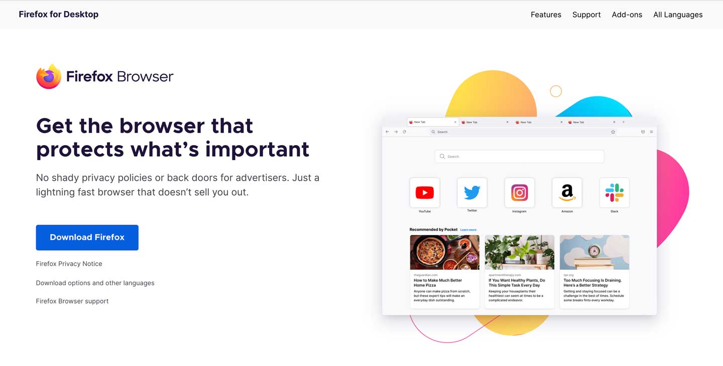
Look at the home page for Firefox. The majority of visitors to the site will be there because they want to use the browser, so there is a clear download button to take you to it.

The second thing is to make your CTA meaningful. Just putting any instruction up and hoping it will be followed because it’s clear is gambling on the idea that your visitors will do something just because you told them to. They won’t. The CTA should be something that your visitor probably wanted anyway, or something that makes things easier for them. In short, it should have some discernible value. It should also be more meaningful than simply “click here” or “more info”. If you can, make the text of your CTA a compelling reason to click it.
3. Engaging headlines
In the main, people don’t read web pages. They scan them. This is why the best web pages are broken down into bite-sized sections. Each of those sections should have a headline of some sort, and that is what your visitor is likely to read while scanning down the page. A well-thought-out headline gives the viewer a reason to investigate that particular section. A dull or ambiguous headline is just a good reason to keep scrolling.
4. Easy to find Contact information
You’d think this would be a given, right? But it’s surprising how many sites still overlook this one fundamental. One of the goals that people will have in visiting your website is being able to get in touch with you. Make it easy for them – have a contact page. Make it easy for them to find your contact page – don’t bury the link to it in a second-level sub-menu in your navigation, make it top level. And put it in your footer.
Obfuscated contact information looks like you don’t want anyone to bother you. Conversely, the easier you make it for people to find a way to get in touch, the more likely that they will.
5. About Us page
You need somewhere on your site where visitors can find out about you. Not wanting to talk about yourself isn’t an option. It will come across as shady rather than modest. Be open about yourselves. Better yet, if it is possible, humanise your business. Show who is involved and communicate your ideals. If you can connect with your audience on some level, they are more likely to want to engage with you.
Must Nots
1. Autoplay content with sound
Just no. This shouldn’t even need to be said now because it’s just rude on your part. And giving an option to disable the sound doesn’t cut it – if you must autoplay any content that has sound, have the sound disabled by default with an option to enable it if the user wants to.
But really, if there’s not an actual good reason to have autoplay content then don’t do it for the sake of it. It can slow down your page load, which is not good on a number of levels.
2. Poor stock images
Unless you are making some kind of an art statement, there’s no excuse for cheesy stock images. Credit your audience with having seen so many already on other sites that they can spot them a mile off. Using imagery that is so obviously from stock will only serve to lower trust in your site.

If at all possible, use bespoke imagery so that it is apparent you are putting yourselves on display, people react well to authenticity. If bespoke imagery is not an option, or not an option for everywhere on the site, there’s still no need for lazy stock image selections. Spend some time on stock library sites. Use their board features to make up shortlists or pools for all image requirements so that you can make the best choice for each image placement (not just the first one you found that looked plausible). The quality of photography on sites such as iStock and Shutterstock has come along in leaps and bounds over the past decade, so with a little diligence, you should be able to find imagery that looks like it was taken for the site rather than just shoehorned in. Even free stock sites like Unsplash are full of professional, natural-looking photographs. Perceived authenticity is still better than obviously fake.
3. Broken links
This is just good housekeeping. Sites go down, pages get changed, and links do break. But if you have a broken link on your site, it’s your responsibility to do something about it. Find an alternate page to link to, or just remove the link from the text if appropriate. But don’t leave a dead link there once you know about it. It (rightfully) makes you look lazy.
You should check through the links in your site periodically to keep on top of this. Deadlinkchecker.com offers a free online broken link checker for your entire site without the need to sign up for free trials.
4. Errors in your contact information
Once again, like broken links, this is just lazy. Your site is a point of contact. How do you think your audience will regard you if you can’t even be bothered to keep your contact information up to date? If a potential customer tries to phone you and gets a disconnected number, the chances are excellent that they won’t pursue contact with you, especially if there’s another site to try.
5. Long paragraphs
This is a mistake we see frequently, even from good writers. The key is to know your audience, and what you need to know about web page readers is that they largely don’t like to read. They have short attention spans and like to scan.
And in addition to that, many of your visitors, if not the majority of them, will be viewing your pages on some kind of mobile device. Long paragraphs on a smartphone screen become a sea of text. And without any kind of investment on the reader’s part, they will just be scrolled through if you are lucky and the viewer doesn’t simply abandon the page.
If you must have large areas of text, break it up into smaller paragraphs. Write with your mobile viewer in mind. If you can, break it up with engaging headlines as mentioned above to actually help your viewer with their scanning.

That’s all folks?
Well, not really. At all. But it’s a start. If you want to know how else your site could be improved, contact us today for an honest appraisal of what could be done to enhance how it delivers business for you. We’re nerds and love talking about websites, but we do it in plain English.
Posted by: Jean Paldan
May 09, 2022


