Why is colour important?
Colour is an exceptionally powerful element in web design. It is one of the very first things to make an impression on the viewer – usually before text, typography, and even images, are recognised and processed.
It aids recognition (just think of all the brands you can recognise by colour alone) and influences at an unconscious level, affecting emotion and ultimately judgement.
And, like all powerful things, it can work greatly in your favour if handled correctly or be disastrous if not. A site that uses colour well can either make a visitor feel at ease or excite them, encourage them to take action and even foster brand loyalty.
Using colour
You may have already come across the phrase “Colour Theory”. This, simply put, is a set of principles intended to help you create balanced and effective colour combinations. Much like musical notes, some colours work very well together and give a deeply pleasing effect, whilst others clash in visual discordance.
What is colour?
In order to use colour well, it’s important to have a basic understanding of it beyond knowing that Richard of York gave battle in vain. For a simple explanation of colour, you could do worse than asking Crayola who define it as “the aspect of things that is caused by differing qualities of light being reflected or emitted by them.”
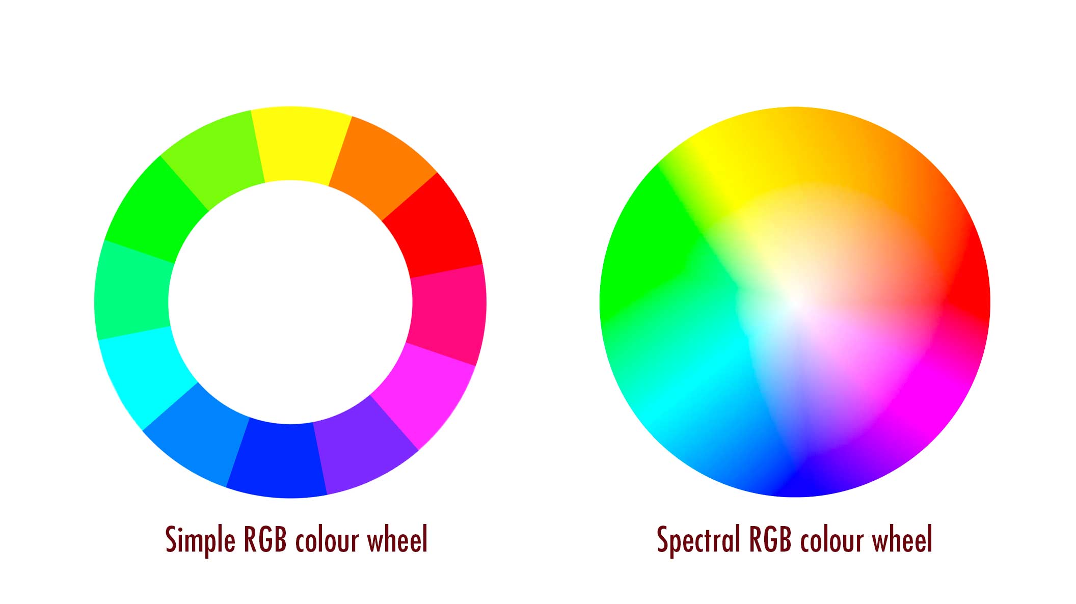
When describing colour on screen, we are dealing with emitted light and use a model called RGB. This means that any colour, even black and white, can be described as a combination of varying amounts of red, green and blue. A popular visual representation is the Colour Wheel as shown below.

Combining colours
This is where things get really interesting. How you combine colours in your site’s colour scheme very much depends on what kind of reaction you want from your viewers. Here are three popular types of colour scheme:
Monochromatic – all the colours in the scheme are a variation on a single colour. This is good for when you want to promote a soothing effect as the combination is naturally easy on the eyes.

Analogous – where there is a dominant colour and supporting colours. All of them will be close neighbours on the colour wheel, with the supporting colours usually being tertiary colours adjacent to the dominant. The effect is generally appealing, being a pleasing mix of hues without clash.

Complimentary – the most basic form of complementary colour scheme is two contrasting colours, usually opposites on the colour wheel. This is very good if you want to get attention, for example highlighting elements like buttons. It can also be used in colour schemes for sites that want to feel dynamic or edgy.

There are many more types of colour scheme models, a good place to explore them is Adobe’s colour wheel tool (which was used to help generate the above examples).
How many colours should you use?
There are no rules here, but if in doubt keep it simple. The more colours in your site’s palette, the harder it is to achieve a visual balance. You also run the risk of overwhelming the viewer if you use too many colours. You should consider the colours in your site’s colour scheme as being functional as well as aesthetic, with each having a purpose. This will make it easier to judge the placement of colour based on what job it does. Most sites work very well with just two colours (in addition to black and white), some of the most striking sites use only one accent colour.
Remember accessibility
Often overlooked, accessibility is a crucially important consideration in choosing a colour scheme. Get it wrong, and approximately five per cent of your visitors will have real difficulty using your site. For more on the subject, you can check out our post on why accessibility is important, but the two key things to remember are
- avoid using colour alone to communicate something
- avoid low contrast between colours, especially when it comes to text
Which colours to use
This is where we dip into the realm of Colour Psychology which, if you’ll forgive the pun, is a somewhat grey area. Attributing meaning to colours can depend on a number of factors including culture and subjective experience. What different colours mean to us is invariably something learned, whether directly through association (green means nature because most plants are green) or by context (red means danger because red is the colour most commonly used to signify danger).
Invariably, humans will take meaning from colours by associating them with where they have been seen before. Which means that different shades of the same colour can have different meanings – green, for example can have vastly different associations depending on where it has been seen previously, including nature, military, aliens, sickness, freshness, upmarket, and so on. The context the colour is used in plays a part too as it provides another association.
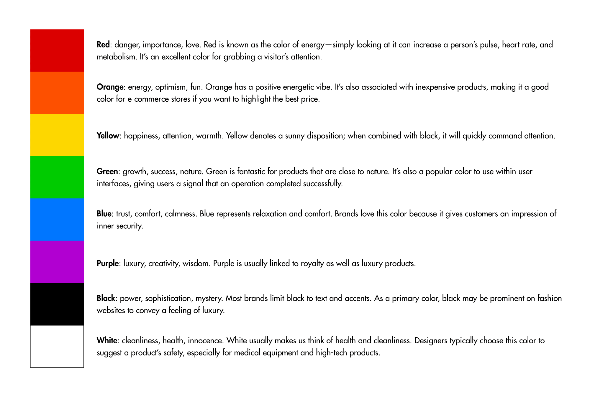
Below are a list of common associations for different colours to be used as guidelines, more lore than law. They are based on the fact that the association has been made so often that there is a collective awareness of it.

Colour combinations can also have very immediate and specific connotations. Yellow and black can communicate a hazard, while red and green together tend to say Christmas.
If your site is intended to have an international or even global audience, you need to be aware of cultural differences in colour association. For example, you may associate yellow with positivity, happiness, sunshine, etc. Many African nations associate it with high rank and wealth, Japan associates it with courage (in contrast to Americans) and in China, it is closely associated with pornography. Greatly differing meanings for the same colour, all because of how different cultures perceive it.
To sum up
Colour may not seem like it’s deserving of so much consideration, but it is. It is usually the one facet of your design that has the greatest impression on your visitors without them being aware of it. For example, if you are selling a product then certain colours can influence spending because of their perceived meaning (Black for sophistication, orange for affordability, green for eco-minded consumers). The colour of a call to action button can have a significant impact on the likelihood of it being clicked. If you have a specific audience in mind, then your choices of colour could either make them feel welcome or alienate them.
Colour is a powerful tool. Putting time and careful consideration into your choices, maybe even seeking advice from professionals, is certainly worth it if you want to get the best return from your site.
Posted by: Jean Paldan
Jul 01, 2021


