So, you want to land that perfect design job.
The one you have been dreaming about for years and the one you have been working so hard to get… but you look down and in front of you is a word document CV that will end up going straight into the trash.
Today I am going to run through a few things that make for the perfect CV, and if it helps you land that dream job… I expect a drink.
Personality:
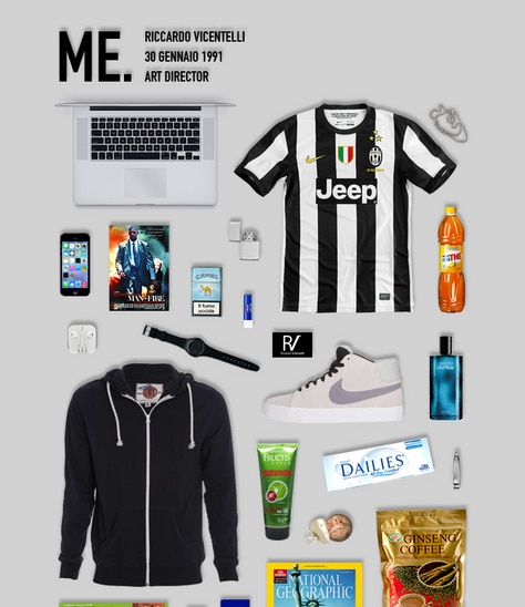
With any type of CV you’re selling yourself to the company (you and hundreds of other hopeful applicants), so you need to show your personality. You have all the skills, you can speak perfect Asgardian, ride a horse backwards whilst designing the perfect logo, and you’re a pro Adobe user… but if you have no personality then what makes you stand out or fit in with the company? Employers don’t want to hire someone who is going to leave within a few months, they want someone who is going to stick with the company and grow within it. So they look for someone who will do just that, who will get along with the employees and share the companies personality. You only get so far in life being a Cyberman.
Keep It Simple:
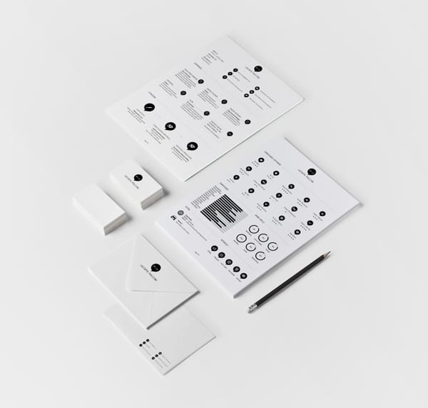
Companies get hundreds of CVs through email/post when a position opens. Everyone is gunning for the position and the employer has to read through all of them whilst running their business. They don’t have time to read through your 15 chapters and 200 pages CV. So you need to only include the key information. A neat way to still include any information you want to tell them but didn’t make the cut for your CV is to add it onto your covering letter. CVs are the first thing an employer will read if that grabs their attention then they will read your covering letter which can explain further your skills. They will be more interested in reading about them if you have already caught their attention with your CV. Remember, white space is our friend.
But Don’t be Scared to Make it Pop:
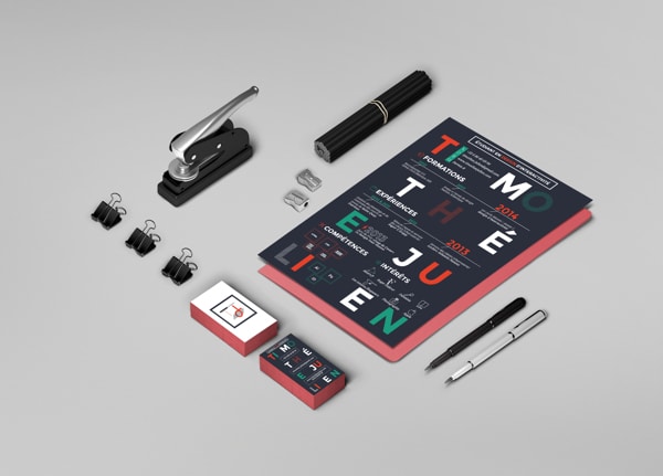
Keeping your CV simple is a wise choice, but it doesn’t mean you can’t make it pop. If your CV grabs the attention of the employer straight away then later on when they’re making their decisions for interviews they will instantly be reminded of your CV. Use jazzy paper, bright colours or fancy printing techniques to make sure you CV stands out from the crowd.
Physical vs Email CV:
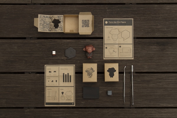
For certain jobs emailing your CV is for the best, if you were applying for a Digital Marketing job then creating an online campaign or website as your CV would be great and show that you’re comfortable with technology and know what you are talking about. However, if you were applying for a graphic design job then creating a physical CV would be great. Promotion packs as CVs work incredibly well, you get to show your skills off whilst giving the employer something that can touch and remember better.
Brand Yourself:
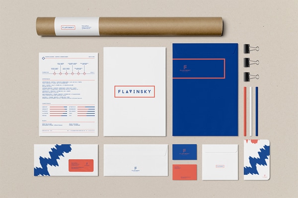
If you want to impress a potential employer then branding yourself is a good step. Creating your own logo, business cards etc shows the employer that you are serious about your career and it also helps you gain freelance work. Everything from your CV, business cards, and covering letter need to be as one. It’s no use having business cards that don’t fit the style of your CV, or a covering letter that doesn’t carry through the design of your CV.
Other tips:
If you’re emailing a CV make sure you have tested what it looks like when printed out in black and white, employers like to print out the CVs they get and if they can’t make out the CV when printed or it uses too much ink they will lose interest. Remember to include the right information, all CVs should have your contact details, employment history, skills, and education, anything else is just a bonus. Finally always check your spelling and grammar, pass your CV onto a few friends before you send it out so they can help double check it.
——–
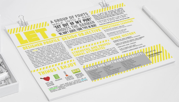
Jeannie (MD of Rare Form): “This article was written by Luke, our latest addition to the Rare Form team. When we did a shout out for his position as a graphic designer, we got well over 100 resumes for the position. Luke’s CV stood out for a few reasons. It was well designed (infographic style), he had a couple of jokes on it (which I laughed at), but primarily, it oozed with personality. His CV said in an instant that he would fit in with our quirky Rare Form team…that’s what got him shortlisted. When he came into interview, he was a true reflection of what was on that CV, and he won us over, got the job, and we could not be happier with him.
The key here is personality…don’t try to sell to everyone, be unique, be a special snowflake, be *you* to the fullest extent. Because someone will see that uniqueness and say, ‘hey that gels with us’. Check out his winning CV below. :)”
Posted by: Jean Paldan
May 21, 2014


