Because our website works on an SEO level, we get a lot of inquiries from the form on our website. Today I received an email from someone pointing out a typo in an infographic that we made quite awhile back. Here is that email:
————————————————————————————–
tell us about your project:
fyi — Your infographic (item #2) Pdf file has a misspelling of the word “discerning” — the “n” between the letters “r” and “i” is omitted.
Otherwise, it’s a great illustration.
Thanks for disseminating this valuable information.
Visit My Productivity and Knowledge transfer Web site at http://sonoffconsulting.com (if you’d like to know more about my company’s expertise in “world-class level Web site best practices”).
Thanks!!!
——————————————————————————————-
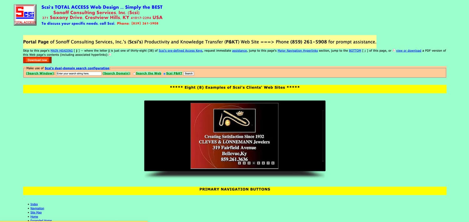
So of course, I clicked on the link taking me to Sonoff Consulting, being prepared to be wowed by the company’s expertise in ‘world-class level website best practices’ to find this:

And boy, wowed I was. All I kept thinking was wowwwwwww. And when I went deeper…I found this…(if you can’t read the boxed text it says ‘A-W-F-U-L World-Class Level Design’, click the image, it will take you to the page, but you have to scroll down to get to the navigation There is even an AWFUL infographic).
I’ve been designing websites for over 16 years now…and I have to say that I have never seen anything quite like it (at least not in the 21st century).
From the rebellious colour pallet that seems to say ‘I laugh at you and your colour wheel standards’, to the adventurous font pairing of Lucida Grande with Tahoma, to the brazen use of embossed buttons; this site has it all (except for a lens flare).
It is a treasure trove for your senses…I swear you can almost smell it as you hover over a button, and it turns bright red. The more you click, the deeper you go, the more you are given…it’s a website that just keeps giving and giving.
So thank you Sonoff Consulting for bringing a ray of sunshine to an otherwise grey and bleak day in England. This has been Jeannie, I’m out.
Posted by: Jean Paldan
Dec 02, 2014


